Screens lie and dye lots drift. How garment color really gets specified — physical references, Pantone, and a controlled sample check that locks it.
A client once sent us a screenshot and the words "this exact green." The screenshot was a photo, of a garment, taken indoors, compressed by a chat app, displayed on our office monitor. Between the original fabric and our eyes, that green had passed through five distortions — camera sensor, lighting, compression, screen calibration, ambient light — and every one of them changed it. This article is about closing that gap: how color is actually specified, matched and approved in garment production.
Why screens cannot be trusted
Your phone and our monitor render color differently — brightness, color profile, even dark mode change what you see. The same hex code looks different on two devices side by side. Digital references are fine for direction ("forest green, muted") but nothing rendered on a screen can serve as a production standard. Production needs a physical anchor.
The three ways to specify color, ranked
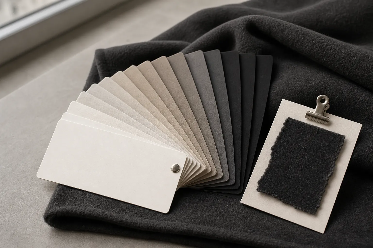
1. A physical reference (best). A fabric swatch, a garment piece, even a cut corner of a sleeve. Physical color under agreed, controlled lighting is the ground truth every other method approximates. If you own something in exactly the right color, mail it — it outperforms every code.
2. A Pantone reference (industry standard). Pantone numbers exist precisely to solve the screen problem: a numbered physical standard both sides can hold. For garments the TPG/TCX textile ranges are the relevant ones. Quote a Pantone number at design review and we match dye or source fabric against the physical standard, not a screen rendering of it. One honest caveat: a Pantone chip is printed color on paper or cotton — the same number reads slightly differently on fleece versus jersey versus twill, because texture changes how light returns. Which leads to the part that actually locks it —
3. A hex code / screenshot (direction only). Useful to communicate intent fast, never sufficient to approve against. We treat these as the start of the conversation, and will say so rather than pretend otherwise.
Side by side:
| Method | What it is | Role in production |
|---|---|---|
| Physical swatch or garment | Physical color under agreed viewing conditions, the ground truth | The best production standard; mail it if you own the right color |
| Pantone TCX/TPG number | A numbered physical standard both sides can hold; reads slightly differently on fleece, jersey and twill | The industry-standard reference we match dye or fabric against |
| Hex code / screenshot | A screen rendering that differs on every device | Direction only; starts the conversation, never approves it |
Dye lots: why "the same color" varies batch to batch
Fabric is dyed in lots, and two lots of the same recipe can differ subtly — dye concentration, water, temperature, timing all drift within tolerances. The industry manages this, not eliminates it:
- Within one production run, your garments cut from the same lot match each other. This is why fabric for an order is committed as a batch.
- Between orders (your reorder three months later), a new dye lot can sit a shade off the last one. A good factory checks new lots against the retained standard from your previous run and flags meaningful drift before cutting — which is one of the quiet reasons to keep reordering from a factory that keeps your records rather than re-briefing a new one each season.
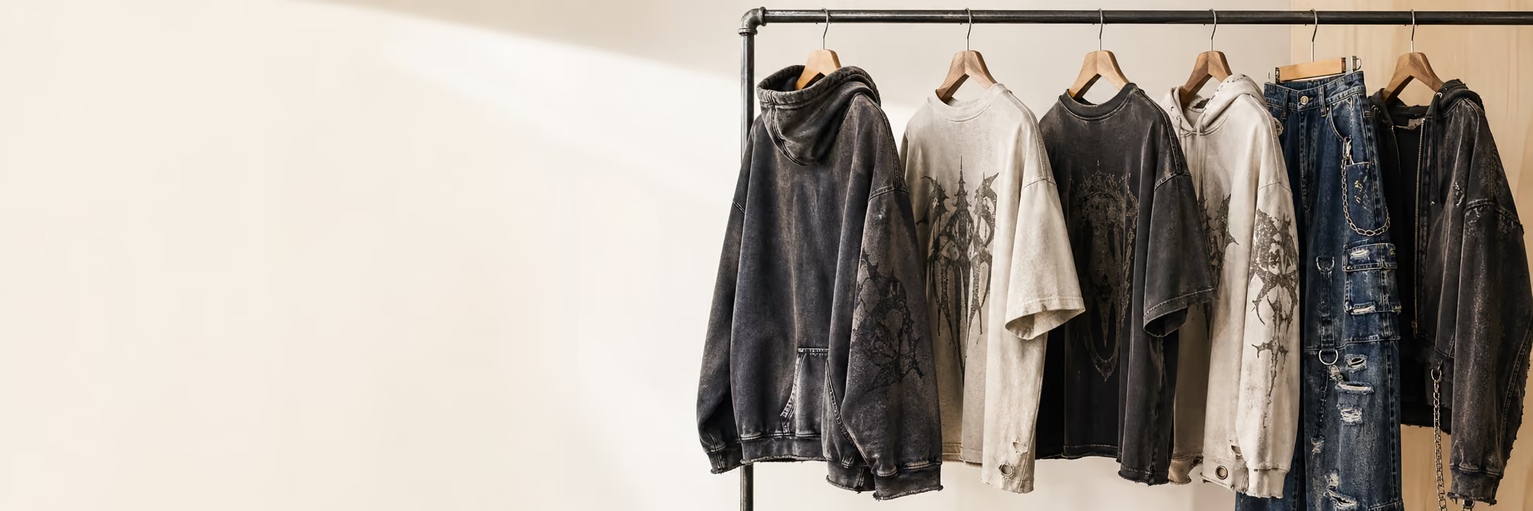
- Garment-dyed and washed programs wear their variation openly — piece-to-piece character is the point, and what you approve is a target tone plus an acceptable band, as covered in our denim wash guide.
Where color actually gets locked: the sample
Everything above is preparation. The binding step is the same one that locks fit and decoration: the physical sample, judged under agreed viewing conditions. For critical approval, use a controlled light source and compare the sample with the physical standard in the same orientation. ASTM D1729-22 recommends simulated D65 daylight for general color appraisal; changing window daylight is useful for observation but not a reproducible pass/fail condition. Approve the sample under the recorded condition, then retain it as the bulk comparison standard. Our sample approval checklist covers the full sign-off, color included.
Custom dye, printed artwork, and the assembled garment need different evidence. The lab dip, print strike-off, and PP sample guide shows how to record each approval without treating one swatch as proof of the others.
Two practical notes from our floor in Dongguan: first, judge color on the actual fabric of your order — if you approved a swatch of jersey, do not expect fleece to read identically. Second, when a design pairs bodies and trims ("hoodie body, matching rib, matching drawcord"), those components are often different materials taking dye differently — matching them is real work that happens at sampling, and one more reason sets and trims are developed together.
The quick protocol
- Send direction however is convenient (screenshot, hex, "like this jacket").
- Anchor it physically: Pantone number or a mailed swatch, noted in your tech pack or brief at design review.
- Approve color on the physical sample, under the agreed controlled light, on the real fabric — samples arrive in 10-15 working days.
- Bulk is produced from committed fabric lots and checked against your approved sample. Any production photos and progress checkpoints are agreed for the project; the sample remains the color truth.
FAQ
Do I have to buy a Pantone book? No. A single physical reference — swatch, garment, even purchased Pantone chip for one color — does the job. Factories own the books.
Can you match any Pantone exactly? Matching is to the standard within textile tolerances, confirmed on the physical sample. On some fabric-and-color combinations (fluorescents, certain deep shades on certain fibers) we will tell you at design review what is realistic rather than promise a screen fantasy.
Why does the same hoodie look different in your photos and in my hands? The same five distortions from this article's first paragraph, in reverse. Production photos document progress and construction; color verdicts wait for the garment.
What about color consistency across sizes? Sizes in a run are cut from the same fabric lots, so consistency across the size run is the normal outcome — it is between separate orders where lot management matters.
Next steps
Continue your sourcing research
Connect this guide to the relevant production service, then compare the related decisions before sending a brief.
Fabric Sourcing
Choose fabric type, weight, stretch, handfeel and wash direction before sampling men's hoodies, T-shirts, pants, denim or streetwear sets.
Review this service →Related buyer guideVintage Wash vs Garment Dye vs Acid Wash: Which Finish?
A Dongguan streetwear factory compares vintage wash, garment dye, and acid wash: look, fabric needs, shrinkage, cost, and why sampling locks your tone.
Read guide →Related buyer guideLab Dip vs Strike-Off vs PP Sample: What Each Approval Proves
A lab dip approves dyed color, a strike-off approves a print, and a PP sample approves the assembled result. Learn the sequence and limits of each.
Read guide →Need this turned into a production quote?
Send your target style, fabric notes, decoration details and quantity so Jiashun can review the production path.